Visual Language
VISUAL LANGUAGE
BRAND
Wreckmaster, WreckMasterU, and WreckMaster Product Shop each have their own logo.




PHOTOGRAPHY
The primary colour is safety green. The WreckMaster “look” is strong, clean, tough but not dirty. Black and white photography with strategic pops of colour. It’s a look and feel designed to appeal both to operators and, ultimately, the general public.

TRADE SHOW MATERIAL
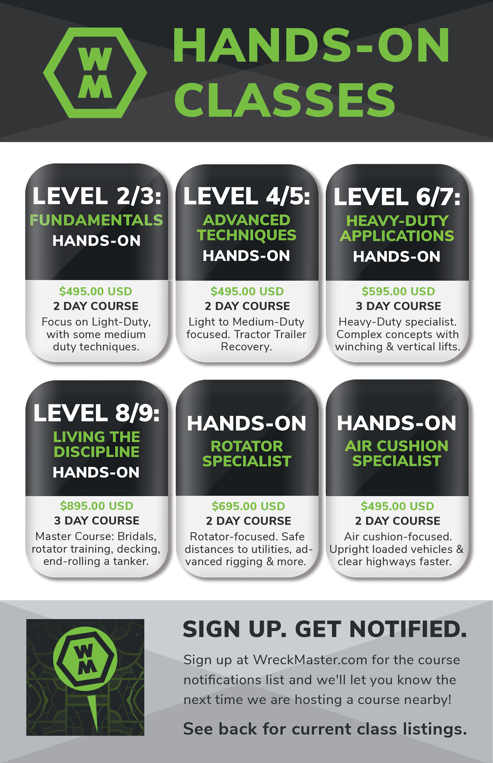
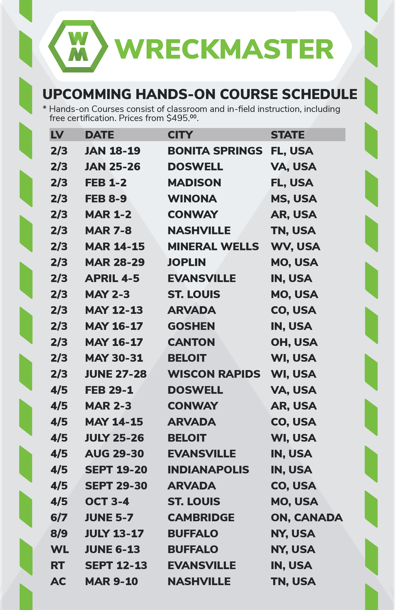
Generally a dark background with pops of WreckMaster Green. Visual components are either the green dash line, or chevron. Each follow the same angle found in the WM Logo.
MAIL OUT FRONT

MAIL OUT BACK

HAND OUT FRONT
HAND OUT BACK
ICONS
Square icons are clean, simplistic, and well padded with a text description underneath a central icon. While the Button Style Icons have are the same design, but with rounded edges, button highlights, and a drop shadow. Each are composed with three colors, WM Black, WM Green, and White.
SQUARE STYLE

BUTTON STYLE
